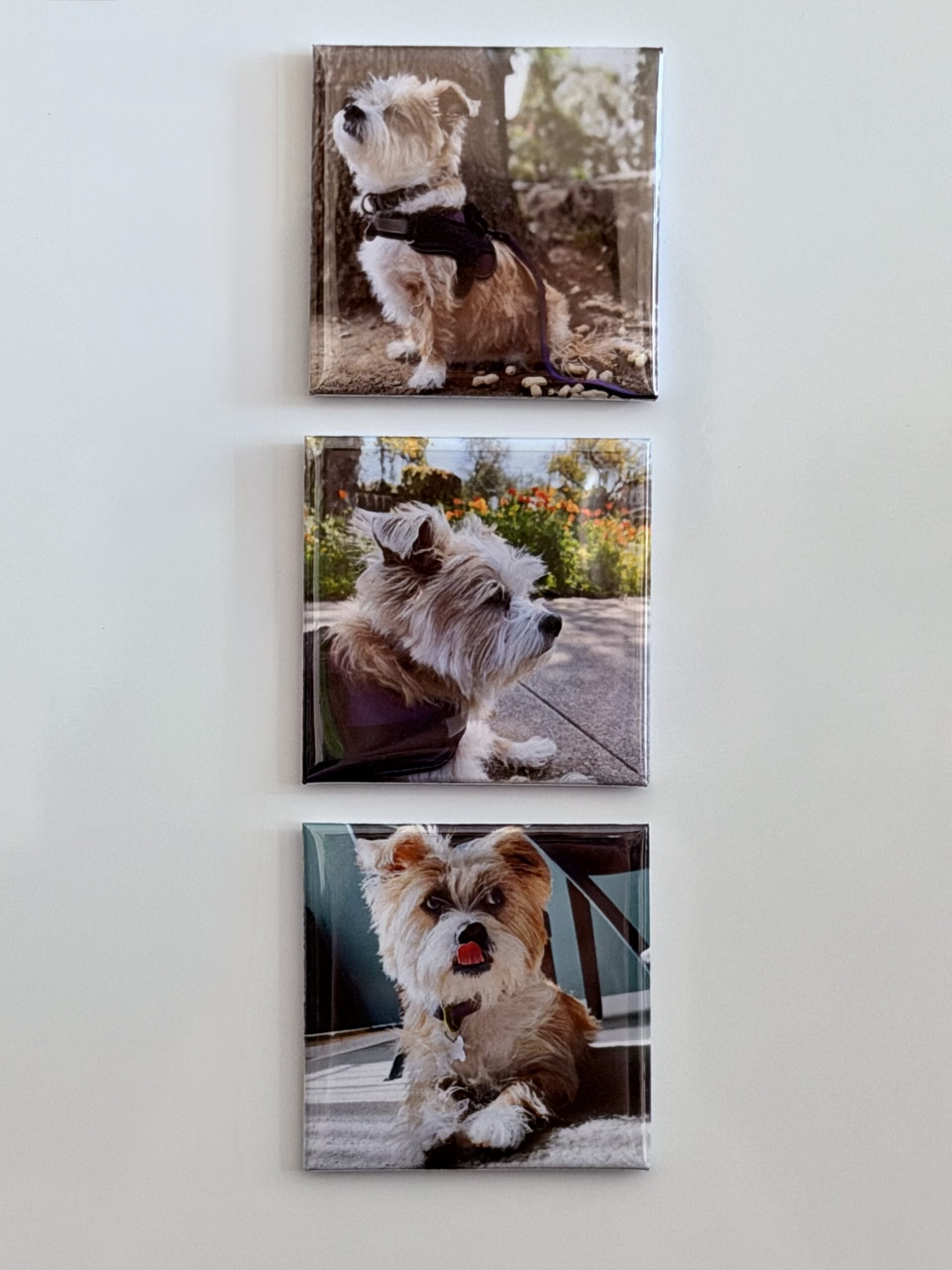
Set of 3
Pick the three photos you never want to forget. The perfect first order.
$14
{
“@context”: “https://schema.org”,
“@type”: “Organization”,
“name”: “Snap Happens Co”,
“url”: “https://snaphappens.co”,
“description”: “Custom 2×2 photo magnets made in the USA. Ships in 2-3 business days. Bundles start at $14.”,
“brand”: { “@type”: “Brand”, “name”: “Snap Happens Co”, “slogan”: “Snap. Keep. Repeat.” }
}
{
“@context”: “https://schema.org”,
“@type”: “Product”,
“name”: “Custom Photo Magnets”,
“description”: “Custom 2×2 photo magnets made in the USA. One photo per magnet. Bundles of 3, 6, 9, and 16. Ships in 2-3 business days.”,
“brand”: { “@type”: “Brand”, “name”: “Snap Happens Co” },
“url”: “https://snaphappens.co/create-my-magnets/”,
“image”: “https://snaphappens.co/wp-content/uploads/2026/05/9-custom-photo-magnets-flat-lay-snap-happens-co.jpeg”,
“countryOfOrigin”: “US”,
“offers”: [
{ “@type”: “Offer”, “name”: “Set of 3”, “price”: “14.00”, “priceCurrency”: “USD”, “availability”: “https://schema.org/InStock”, “url”: “https://snaphappens.co/checkout” },
{ “@type”: “Offer”, “name”: “Set of 6”, “price”: “27.00”, “priceCurrency”: “USD”, “availability”: “https://schema.org/InStock”, “url”: “https://snaphappens.co/checkout” },
{ “@type”: “Offer”, “name”: “Set of 9”, “price”: “39.00”, “priceCurrency”: “USD”, “availability”: “https://schema.org/InStock”, “url”: “https://snaphappens.co/checkout” },
{ “@type”: “Offer”, “name”: “Set of 16”, “price”: “66.00”, “priceCurrency”: “USD”, “availability”: “https://schema.org/InStock”, “url”: “https://snaphappens.co/checkout” }
]
}
{
“@context”: “https://schema.org”,
“@type”: “HowTo”,
“name”: “How to Order Custom Photo Magnets from Snap Happens Co”,
“description”: “Turn your favorite photos into 2×2 custom magnets in three simple steps.”,
“totalTime”: “PT5M”,
“estimatedCost”: { “@type”: “MonetaryAmount”, “currency”: “USD”, “value”: “14” },
“step”: [
{ “@type”: “HowToStep”, “position”: 1, “name”: “Choose Your Bundle”, “text”: “Pick the number of magnets you want. Options: 3 for $14, 6 for $27, 9 for $39, or 16 for $66. Sets of 9 and 16 include free shipping.” },
{ “@type”: “HowToStep”, “position”: 2, “name”: “Complete Checkout”, “text”: “Enter your shipping and payment info. No photo upload required before checkout.” },
{ “@type”: “HowToStep”, “position”: 3, “name”: “Upload Your Photos”, “text”: “After checkout, upload your photos in under 2 minutes. Your magnets ship within 2-3 business days.” }
]
}
{
“@context”: “https://schema.org”,
“@type”: “FAQPage”,
“mainEntity”: [
{ “@type”: “Question”, “name”: “How do I order custom photo magnets from Snap Happens Co?”, “acceptedAnswer”: { “@type”: “Answer”, “text”: “Choose your bundle size, complete checkout, then upload photos afterward. Your magnets ship within 2-3 business days.” } },
{ “@type”: “Question”, “name”: “What size are the photo magnets?”, “acceptedAnswer”: { “@type”: “Answer”, “text”: “All magnets are 2 inches by 2 inches, made in the USA on high-quality magnetic material.” } },
{ “@type”: “Question”, “name”: “Is there free shipping on photo magnets?”, “acceptedAnswer”: { “@type”: “Answer”, “text”: “Yes. Orders of 9 or more magnets include free shipping to any US address.” } },
{ “@type”: “Question”, “name”: “How long does shipping take?”, “acceptedAnswer”: { “@type”: “Answer”, “text”: “Magnets ship within 2-3 business days after photo upload. Most US customers receive orders in 5-7 business days.” } },
{ “@type”: “Question”, “name”: “What is the return policy?”, “acceptedAnswer”: { “@type”: “Answer”, “text”: “30-day satisfaction guarantee. If you are not happy, contact us and we will fix it.” } },
{ “@type”: “Question”, “name”: “Can I use photo magnets as a gift?”, “acceptedAnswer”: { “@type”: “Answer”, “text”: “Yes. Popular for Mother’s Day, Valentine’s Day, graduations, and holidays. Ship directly to the recipient.” } }
]
}
/* ═══════════════════════════════════════════
1. DESIGN TOKENS
═══════════════════════════════════════════ */
:root {
–shc-cream: #fffcf5;
–shc-beige: #F4EDE0;
–shc-sand: #E9E1D2;
–shc-yellow: #FFDA1A;
–shc-black: #1A1A1A;
–shc-coral: #FF6B5E;
–shc-coral-dark: #e05a4f;
–shc-sage: #6F7F5F;
–shc-warm-gray: #8E8E8E;
–shc-white: #ffffff;
–font-serif: ‘Playfair Display’, Georgia, serif;
–font-sans: ‘DM Sans’, -apple-system, BlinkMacSystemFont, sans-serif;
–space-xs: 8px;
–space-sm: 16px;
–space-md: 24px;
–space-lg: 40px;
–space-xl: 64px;
–space-2xl: 96px;
–radius-sm: 6px;
–radius-md: 12px;
–radius-lg: 16px;
–radius-xl: 24px;
–container-max: 1160px;
–container-pad: 52px;
}
/* ═══════════════════════════════════════════
2. RESET + BACKGROUND CONTINUITY
═══════════════════════════════════════════ */
*, *::before, *::after { box-sizing: border-box; margin: 0; padding: 0; }
body,
body #page,
body .site,
body #masthead,
body .ast-above-header-wrap,
body #colophon,
body .ast-small-footer {
background-color: var(–shc-cream) !important;
}
body {
font-family: var(–font-sans);
color: var(–shc-black);
background-color: var(–shc-cream);
-webkit-font-smoothing: antialiased;
line-height: 1.6;
overflow-x: hidden;
}
img { display: block; max-width: 100%; }
/* ═══════════════════════════════════════════
3. SKIP NAV
═══════════════════════════════════════════ */
.shc-skip { position: absolute; top: -100%; left: 16px; background: var(–shc-coral); color: #fff; padding: 8px 16px; border-radius: 6px; font-size: 14px; font-weight: 600; z-index: 9999; text-decoration: none; }
.shc-skip:focus { top: 16px; }
/* ═══════════════════════════════════════════
4. LAYOUT
═══════════════════════════════════════════ */
.shc-wrap {
max-width: var(–container-max);
margin-inline: auto;
padding-inline: var(–container-pad);
}
/* ═══════════════════════════════════════════
5. BLOBS + ANIMATIONS
Matched to homepage visual style:
solid organic shapes, bold presence, warm palette
═══════════════════════════════════════════ */
/* Shape morphs slowly — border-radius shifts give organic feel */
@keyframes shc-morph-1 {
0%, 100% { border-radius: 60% 40% 55% 45% / 50% 45% 55% 50%; }
33% { border-radius: 45% 55% 38% 62% / 56% 40% 60% 44%; }
66% { border-radius: 54% 46% 62% 38% / 42% 60% 40% 58%; }
}
@keyframes shc-morph-2 {
0%, 100% { border-radius: 55% 45% 60% 40% / 45% 55% 45% 55%; }
40% { border-radius: 40% 60% 44% 56% / 60% 40% 58% 42%; }
70% { border-radius: 62% 38% 50% 50% / 48% 52% 50% 50%; }
}
@keyframes shc-morph-3 {
0%, 100% { border-radius: 58% 42% 52% 48% / 46% 54% 46% 54%; }
50% { border-radius: 42% 58% 60% 40% / 54% 46% 52% 48%; }
}
/* Gentle drift */
@keyframes shc-drift-1 {
0%, 100% { transform: translate(0, 0); }
50% { transform: translate(18px, -14px); }
}
@keyframes shc-drift-2 {
0%, 100% { transform: translate(0, 0); }
50% { transform: translate(-14px, 12px); }
}
@keyframes shc-drift-3 {
0%, 100% { transform: translate(0, 0); }
50% { transform: translate(12px, 18px); }
}
@keyframes shc-drift-4 {
0%, 100% { transform: translate(0, 0); }
50% { transform: translate(-16px, -10px); }
}
/* Base blob — minimal blur, shape does the work */
.shc-blob {
position: absolute;
pointer-events: none;
z-index: 0;
filter: blur(2px);
}
@media (prefers-reduced-motion: no-preference) {
.shc-blob { animation: shc-morph-1 20s ease-in-out infinite, shc-drift-1 26s ease-in-out infinite; }
.shc-blob–alt { animation: shc-morph-2 24s ease-in-out infinite, shc-drift-2 30s ease-in-out infinite; }
.shc-blob–alt2 { animation: shc-morph-3 22s ease-in-out infinite, shc-drift-3 28s ease-in-out infinite; }
.shc-blob–alt3 { animation: shc-morph-1 18s ease-in-out infinite, shc-drift-4 22s ease-in-out infinite; }
}
/* ── Yellow — large, bold, top-right (matches homepage) */
.shc-blob–yellow {
width: 600px;
height: 560px;
background: rgba(255, 232, 80, 0.42);
border-radius: 60% 40% 55% 45% / 50% 45% 55% 50%;
}
/* ── Yellow small — secondary accent */
.shc-blob–yellow-sm {
width: 380px;
height: 360px;
background: rgba(255, 232, 80, 0.30);
border-radius: 55% 45% 58% 42% / 48% 52% 48% 52%;
}
/* ── Beige — warm tan, bottom-left (matches homepage) */
.shc-blob–beige {
width: 500px;
height: 460px;
background: rgba(237, 221, 196, 0.55);
border-radius: 55% 45% 60% 40% / 45% 55% 45% 55%;
filter: blur(2px);
}
/* ── Gray circle — soft muted circle, like the one behind hero copy */
.shc-blob–circle {
background: rgba(210, 200, 185, 0.38);
border-radius: 50%;
filter: blur(6px);
}
/* ── Coral — warm accent peeking from corners */
.shc-blob–coral {
background: rgba(255, 107, 94, 0.12);
border-radius: 58% 42% 52% 48% / 46% 54% 46% 54%;
filter: blur(4px);
}
/* ── Sage — subtle green warmth */
.shc-blob–sage {
background: rgba(111, 127, 95, 0.09);
border-radius: 52% 48% 58% 42% / 50% 50% 50% 50%;
filter: blur(4px);
}
/* ═══════════════════════════════════════════
6. EYEBROW
═══════════════════════════════════════════ */
.shc-eyebrow {
display: inline-block;
font-family: var(–font-sans);
font-size: 12px;
font-weight: 600;
letter-spacing: 2.5px;
text-transform: uppercase;
color: var(–shc-sage);
margin-bottom: var(–space-sm);
}
/* ═══════════════════════════════════════════
8. BUTTONS
═══════════════════════════════════════════ */
.shc-btn {
display: inline-block;
font-family: var(–font-sans);
font-weight: 600;
text-decoration: none;
border-radius: var(–radius-md);
transition: background 0.18s ease, transform 0.18s ease, box-shadow 0.18s ease;
cursor: pointer;
border: none;
}
.shc-btn–coral {
background: var(–shc-coral);
color: var(–shc-white);
font-size: 15px;
padding: 15px 32px;
box-shadow: 0 4px 18px rgba(255,107,94,0.28);
}
.shc-btn–coral:hover {
background: var(–shc-coral-dark);
transform: translateY(-2px);
box-shadow: 0 8px 24px rgba(255,107,94,0.35);
}
.shc-btn–coral:focus-visible {
outline: 3px solid var(–shc-coral);
outline-offset: 3px;
}
.shc-btn–coral-lg {
font-size: 17px;
padding: 18px 44px;
}
/* ═══════════════════════════════════════════
9. BUNDLE CARDS
═══════════════════════════════════════════ */
.shc-bundles {
background: var(–shc-cream);
padding-block: var(–space-2xl);
position: relative;
overflow: clip;
}
.shc-bundles__header {
text-align: center;
margin-bottom: var(–space-xl);
position: relative;
z-index: 1;
}
.shc-bundles__h2 {
font-family: var(–font-serif);
font-size: clamp(28px, 3.5vw, 42px);
font-weight: 900;
color: var(–shc-black);
margin-bottom: var(–space-xs);
line-height: 1.15;
}
.shc-bundles__sub {
font-family: var(–font-sans);
font-size: 17px;
color: var(–shc-warm-gray);
max-width: 420px;
margin-inline: auto;
}
.shc-bundles__grid {
display: grid;
grid-template-columns: repeat(4, 1fr);
gap: 20px;
position: relative;
z-index: 1;
align-items: stretch;
}
/* base card */
.shc-card {
background: var(–shc-white);
border: 2px solid var(–shc-sand);
border-radius: var(–radius-xl);
overflow: hidden;
display: flex;
flex-direction: column;
}
/* featured card */
.shc-card–featured {
border-color: var(–shc-yellow);
border-width: 2.5px;
box-shadow: 0 8px 32px rgba(255,218,26,0.18);
}
/* badge */
.shc-card__badge {
position: absolute;
top: -1px;
left: 50%;
transform: translateX(-50%);
background: var(–shc-yellow);
color: var(–shc-black);
font-family: var(–font-sans);
font-size: 10px;
font-weight: 700;
letter-spacing: 1.5px;
text-transform: uppercase;
padding: 5px 16px;
border-radius: 0 0 12px 12px;
white-space: nowrap;
}
/* image area */
.shc-card__img {
width: 100%;
aspect-ratio: 4 / 3;
object-fit: cover;
object-position: center;
display: block;
background: var(–shc-beige);
}
/* card body */
.shc-card__body {
padding: 14px var(–space-sm) var(–space-sm);
display: flex;
flex-direction: column;
flex: 1;
gap: 4px;
position: relative;
}
.shc-card__count {
font-family: var(–font-serif);
font-size: 18px;
font-weight: 700;
color: var(–shc-black);
}
.shc-card__desc {
font-family: var(–font-sans);
font-size: 13px;
color: var(–shc-warm-gray);
line-height: 1.45;
flex: 1;
}
.shc-card__shipping {
font-family: var(–font-sans);
font-size: 12px;
font-weight: 700;
color: #FFDA1A;
letter-spacing: 0.3px;
text-shadow: 0 1px 2px rgba(180,150,0,0.15);
}
.shc-card__price {
font-family: var(–font-serif);
font-size: 28px;
font-weight: 900;
color: var(–shc-black);
line-height: 1;
margin-top: 2px;
}
.shc-card__cta {
display: block;
width: 100%;
text-align: center;
background: var(–shc-coral);
color: var(–shc-white);
font-family: var(–font-sans);
font-size: 13px;
font-weight: 600;
padding: 10px 16px;
border-radius: var(–radius-md);
text-decoration: none;
margin-top: 10px;
transition: color 0.18s ease, transform 0.18s ease;
letter-spacing: 0.2px;
}
.shc-card__cta:hover { color: var(–shc-yellow); transform: translateY(-1px); }
.shc-card__cta:focus-visible { outline: 3px solid var(–shc-coral); outline-offset: 3px; color: var(–shc-yellow); }
/* upload note */
.shc-upload-note {
text-align: center;
margin-top: var(–space-lg);
position: relative;
z-index: 1;
}
.shc-upload-note p {
font-family: var(–font-sans);
font-size: 15px;
color: var(–shc-warm-gray);
max-width: 400px;
margin-inline: auto;
}
.shc-upload-note strong { color: var(–shc-black); }
/* ═══════════════════════════════════════════
11. TRUST STRIP
═══════════════════════════════════════════ */
.shc-trust {
background: var(–shc-cream);
padding-block: var(–space-lg);
border-top: 1px solid var(–shc-sand);
border-bottom: 1px solid var(–shc-sand);
}
.shc-trust__row {
display: flex;
flex-wrap: wrap;
justify-content: center;
gap: var(–space-sm) var(–space-xl);
}
.shc-trust__item {
display: flex;
align-items: center;
gap: 8px;
font-family: var(–font-sans);
font-size: 15px;
font-weight: 500;
color: var(–shc-black);
}
.shc-trust__icon {
width: 20px;
height: 20px;
flex-shrink: 0;
}
/* ═══════════════════════════════════════════
12. GIFT OCCASIONS
═══════════════════════════════════════════ */
.shc-occasions {
background: var(–shc-cream);
padding-block: var(–space-2xl);
position: relative;
overflow: clip;
}
.shc-occasions__header {
text-align: center;
margin-bottom: var(–space-xl);
position: relative;
z-index: 1;
}
.shc-occasions__h2 {
font-family: var(–font-serif);
font-size: clamp(26px, 3.5vw, 40px);
font-weight: 900;
color: var(–shc-black);
margin-bottom: var(–space-xs);
}
.shc-occasions__sub {
font-family: var(–font-sans);
font-size: 17px;
color: var(–shc-warm-gray);
max-width: 480px;
margin-inline: auto;
}
.shc-occasions__pills {
display: flex;
flex-wrap: wrap;
justify-content: center;
gap: var(–space-sm);
margin-bottom: var(–space-lg);
position: relative;
z-index: 1;
}
.shc-pill {
display: flex;
align-items: center;
gap: 8px;
background: var(–shc-beige);
border: 1.5px solid var(–shc-sand);
border-radius: 50px;
padding: 10px 20px;
font-family: var(–font-sans);
font-size: 15px;
font-weight: 500;
color: var(–shc-black);
transition: border-color 0.18s ease, box-shadow 0.18s ease;
}
.shc-pill:hover {
border-color: var(–shc-yellow);
box-shadow: 0 4px 16px rgba(255,218,26,0.2);
}
.shc-pill__dot {
width: 8px;
height: 8px;
background: var(–shc-yellow);
border-radius: 50%;
flex-shrink: 0;
}
.shc-occasions__note {
text-align: center;
font-family: var(–font-sans);
font-size: 15px;
color: var(–shc-warm-gray);
position: relative;
z-index: 1;
}
/* ═══════════════════════════════════════════
13. FAQ
═══════════════════════════════════════════ */
.shc-faq {
background: var(–shc-beige);
padding-block: var(–space-2xl);
}
.shc-faq__header {
text-align: center;
margin-bottom: var(–space-xl);
}
.shc-faq__h2 {
font-family: var(–font-serif);
font-size: clamp(26px, 3.5vw, 40px);
font-weight: 900;
color: var(–shc-black);
margin-bottom: var(–space-xs);
}
.shc-faq__sub {
font-family: var(–font-sans);
font-size: 17px;
color: var(–shc-warm-gray);
}
.shc-faq__list {
max-width: 720px;
margin-inline: auto;
display: flex;
flex-direction: column;
gap: 10px;
}
.shc-faq__item {
background: var(–shc-white);
border: 1.5px solid var(–shc-sand);
border-radius: var(–radius-md);
overflow: hidden;
transition: border-color 0.18s ease;
}
.shc-faq__item:has(details[open]) {
border-color: var(–shc-yellow);
}
.shc-faq__q {
width: 100%;
background: none;
border: none;
padding: 20px var(–space-lg);
font-family: var(–font-sans);
font-size: 16px;
font-weight: 600;
color: var(–shc-black);
text-align: left;
cursor: pointer;
display: flex;
justify-content: space-between;
align-items: center;
gap: var(–space-sm);
line-height: 1.4;
}
.shc-faq__q:hover { color: var(–shc-coral); }
.shc-faq__q:focus-visible { outline: 2px solid var(–shc-coral); outline-offset: -2px; }
.shc-faq__icon {
flex-shrink: 0;
width: 20px;
height: 20px;
transition: transform 0.22s ease;
}
details[open] .shc-faq__icon { transform: rotate(45deg); }
.shc-faq__a {
padding: 0 var(–space-lg) 20px;
font-family: var(–font-sans);
font-size: 16px;
color: var(–shc-warm-gray);
line-height: 1.75;
}
/* ═══════════════════════════════════════════
14. FINAL CTA
═══════════════════════════════════════════ */
.shc-cta {
background: var(–shc-cream);
padding-block: var(–space-2xl);
text-align: center;
position: relative;
overflow: clip;
}
.shc-cta__inner {
position: relative;
z-index: 1;
}
.shc-cta__h2 {
font-family: var(–font-serif);
font-size: clamp(28px, 4vw, 48px);
font-weight: 900;
color: var(–shc-black);
margin-bottom: var(–space-sm);
max-width: 640px;
margin-inline: auto;
line-height: 1.15;
}
.shc-cta__sub {
font-family: var(–font-sans);
font-size: 18px;
color: var(–shc-warm-gray);
margin-bottom: var(–space-lg);
}
.shc-cta__trust {
margin-top: var(–space-md);
font-family: var(–font-sans);
font-size: 14px;
color: var(–shc-warm-gray);
}
.shc-cta__trust a { color: var(–shc-warm-gray); text-decoration: underline; }
/* ═══════════════════════════════════════════
15. TAGLINE FOOTER
═══════════════════════════════════════════ */
.shc-tagline {
text-align: center;
padding-block: var(–space-lg);
border-top: 1px solid var(–shc-sand);
background: var(–shc-cream);
}
.shc-tagline__text {
font-family: var(–font-sans);
font-size: 13px;
font-weight: 600;
letter-spacing: 4px;
text-transform: uppercase;
color: var(–shc-warm-gray);
}
.shc-tagline__dot {
display: inline-block;
width: 6px;
height: 6px;
background: var(–shc-yellow);
border-radius: 50%;
vertical-align: middle;
margin-inline: 9px;
}
/* ═══════════════════════════════════════════
16. RESPONSIVE — TABLET 1024px
═══════════════════════════════════════════ */
@media (max-width: 1024px) {
:root { –container-pad: 36px; }
.shc-bundles__grid { grid-template-columns: repeat(2, 1fr); }
}
/* ═══════════════════════════════════════════
17. RESPONSIVE — TABLET 768px
═══════════════════════════════════════════ */
@media (max-width: 768px) {
:root { –container-pad: 24px; –space-2xl: 64px; }
.shc-bundles__grid { grid-template-columns: repeat(2, 1fr); }
.shc-blob–yellow { width: 360px; height: 340px; }
.shc-blob–beige { width: 300px; height: 280px; }
.shc-blob–circle { display: none; }
}
/* ═══════════════════════════════════════════
18. RESPONSIVE — MOBILE 480px
═══════════════════════════════════════════ */
@media (max-width: 480px) {
:root { –container-pad: 20px; –space-2xl: 52px; }
.shc-bundles__grid { grid-template-columns: 1fr; max-width: 340px; margin-inline: auto; }
.shc-btn–coral-lg { width: 100%; text-align: center; }
.shc-blob–yellow { width: 260px; height: 240px; }
.shc-blob–yellow-sm { width: 200px; height: 180px; }
.shc-blob–beige { width: 220px; height: 200px; }
}
Choose Your Set
One photo per magnet. Free shipping on 9 or more.
Pick the three photos you never want to forget. The perfect first order.
$14

Six of your favorites on your fridge. Great for home, great for gifting.
$27
✦ Free Shipping
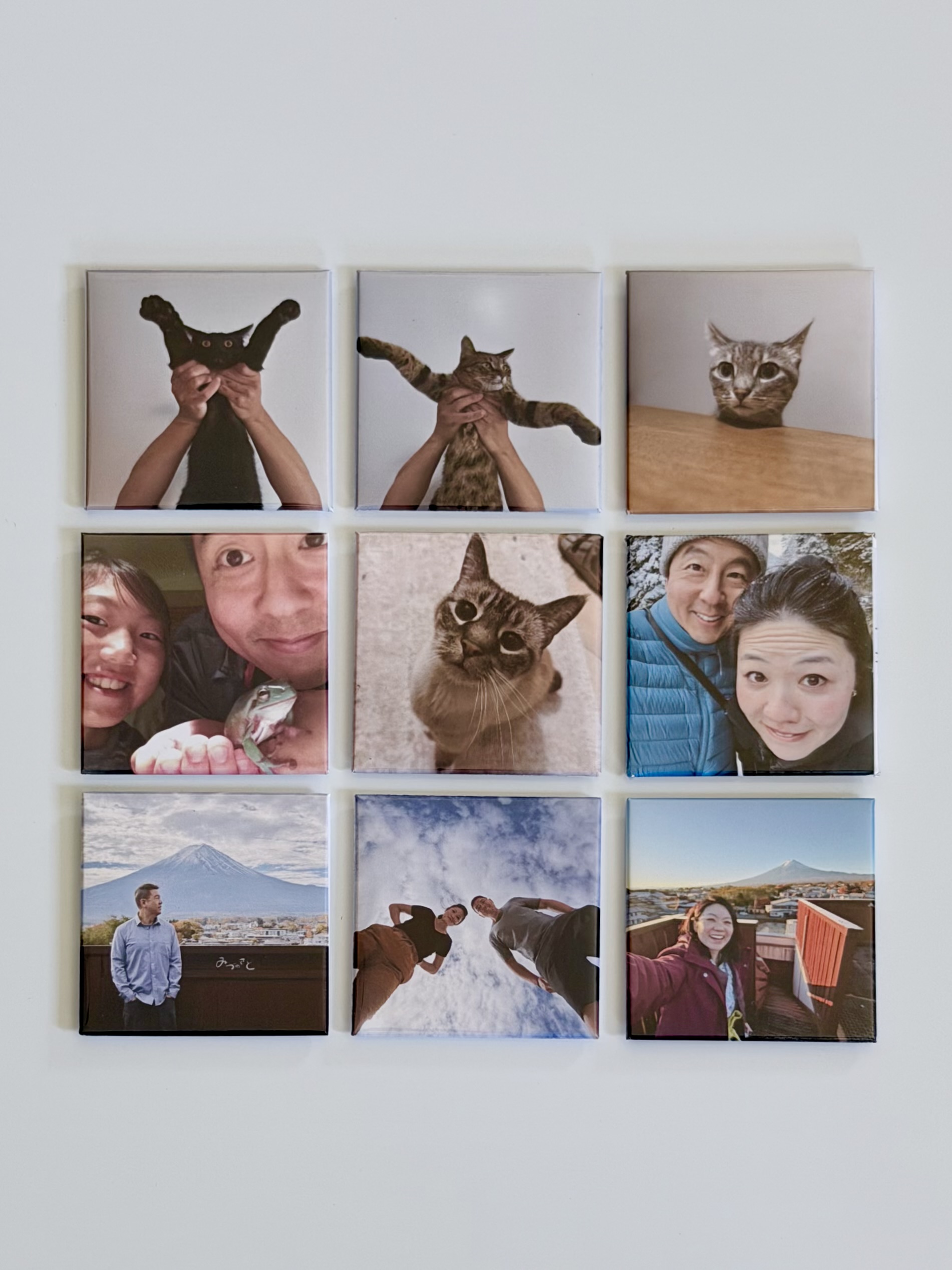
Nine memories. Every room covered. Free shipping to your door.
$39
✦ Free Shipping
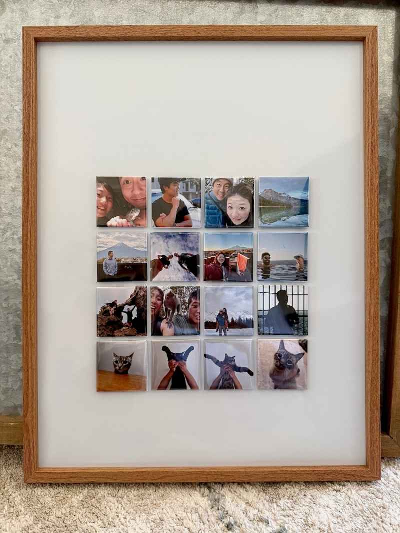
Stock up, gift the extras. The smartest order for memory keepers and gift givers.
$66
No photos needed at checkout.
After you pay, you get a simple link to upload your favorites. Takes under 2 minutes.
A Gift They Will Actually Keep
A photo on a phone gets scrolled past. A magnet on the fridge gets seen every single morning.
Ship directly to the recipient at checkout. Order in under 5 minutes.
Common Questions
No surprises. No confusion. Just answers.
Ready?
Ships in 2–3 business days. Your memories on your fridge by the weekend.
Love it or we fix it · Made in the USA · Starts at $14
· Questions? Contact us.
// FAQ accordion — close others when one opens
(function () {
var items = document.querySelectorAll(‘.shc-faq__item details’);
items.forEach(function (d) {
d.addEventListener(‘toggle’, function () {
if (d.open) {
items.forEach(function (o) { if (o !== d && o.open) o.removeAttribute(‘open’); });
}
});
});
})();